 Skip to content
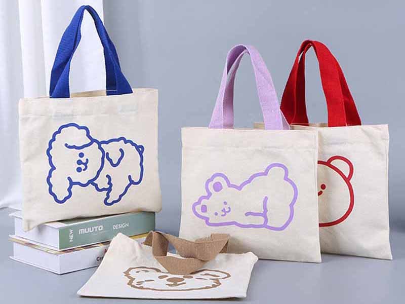
A logo can look perfectly balanced on a computer screen and completely wrong on a finished bag. The artwork may be correct, the colors may match the brand guide, and the dimensions may appear reasonable. Yet once the logo is printed, embroidered, molded, or attached to the actual product, it can suddenly feel too large, too small, too low, or visually disconnected from the bag.
The problem is rarely the logo alone. It is usually the relationship between the artwork, the usable panel, the bag structure, the material, the decoration process, and the way the product is carried.
The right logo size and placement depend on the usable branding area, bag dimensions, viewing distance, logo shape, material, decoration method, and desired brand impression. Start by identifying a flat and visible panel, keep the logo clear of seams and hardware, review it at actual size, test it on the real material, and approve a physical sample before bulk production.
A large centered logo may work well on a promotional tote but overwhelm a compact cosmetic pouch. A small embroidered mark may look refined on smooth canvas but become unreadable on coarse Oxford fabric. A logo positioned neatly on an empty backpack may disappear beneath a shoulder strap, bend when the front pocket is loaded, or tilt when the bag is worn.
There is no single measurement that works for every custom bag. What does work is a structured decision process that combines visual balance, product engineering, manufacturing limits, and real-life use. That process can prevent the frustrating moment when thousands of finished bags arrive and everyone realizes the logo is technically correct but commercially wrong.
Is There a Standard Logo Size?

There is no universal logo size that works for every bag. The right size depends on the usable panel, finished product dimensions, logo shape, viewing distance, material, and branding method. As an early planning guide, many bag logos occupy about 15% to 40% of the usable panel width, but the final size should always be confirmed with an actual-size artwork test and a physical sample.
Usable Branding Area
The usable branding area is not the same as the total width and height of the bag. This is one of the most common causes of incorrect logo sizing.
A tote bag may measure 400 mm wide, but that does not mean a 350 mm logo can be placed across its front. Side seams, handle reinforcement, top hems, bottom folds, gussets, internal supports, and sewing allowances may reduce the practical branding area to 250 or 300 mm.
The same issue is even more noticeable on backpacks. A backpack front panel may be divided by curved pockets, vertical zippers, compression straps, reflective strips, webbing loops, and foam reinforcement. Although the overall bag appears large, the uninterrupted area suitable for decoration may be relatively small.
Manufacturers normally assess both the finished panel and the cut panel. Many logo processes are completed before the bag is assembled:
- Screen printing is often applied while the fabric panel is flat.
- Heat transfer requires space for the press and positioning equipment.
- Embroidery needs sufficient room for a hoop or frame.
- Patches may be sewn before the lining is installed.
- Metal plates may require internal backing before the bag is closed.
The branding area must therefore work visually on the finished product and technically during production.
A practical imprint-area review should include:
- Finished product dimensions
- Cut-panel dimensions
- Seam allowances
- Fold and gusset lines
- Zipper positions
- Pocket openings
- Handle and webbing reinforcements
- Piping and binding
- Internal foam
- Curved or shaped panels
- Access for printing or embroidery equipment
The safest logo zone is usually a relatively flat area that remains visible after the bag is filled and does not carry concentrated structural stress.
Size and Visual Balance
Logo size should be judged according to visual proportion rather than one standard measurement. A 100 mm-wide wordmark may look large on a small cosmetic pouch and almost invisible on a large travel duffel.
Logo shape also changes how size is perceived. A wide horizontal wordmark, a compact square emblem, and a tall vertical symbol can all have the same width but create very different visual weight.
The following ranges are useful for early mockups. They should not replace physical sampling.
| Branding Goal | Approximate Share of Usable Panel Width | Typical Visual Result |
|---|---|---|
| Minimal branding | 10%–20% | Quiet, refined, premium |
| Standard retail branding | 20%–30% | Clear but balanced |
| Strong lifestyle branding | 30%–40% | Noticeable and expressive |
| Promotional branding | 40%–60% | High visibility |
| Full-panel graphic | 60%–100% | Campaign-led or decorative |
These percentages should be calculated from the usable branding area, not the overall bag width.
For example, consider a tote with a total front width of 380 mm. If seams, handle attachments, and side folds leave a clear branding area of 260 mm, a standard retail logo occupying 25% of that area would be approximately 65 mm wide.
Color and contrast also influence perceived size. A solid black logo on a white bag usually appears larger and stronger than a tonal dark-grey logo in the same dimensions. A thick, compact emblem may feel heavier than a thin wordmark. Negative space, letter thickness, graphic density, and fabric color all affect the final result.
A logo should be large enough to be recognized but not so large that it makes the product feel like an advertising board unless that is the intended purpose.
Clear Space and Boundaries
A logo needs clear space for two reasons: visual separation and manufacturing safety.
When artwork is placed too close to a seam, zipper, edge, handle, or pocket, even a small variation in sewing or logo placement becomes obvious. A logo that sits comfortably within an open panel looks intentional. A logo that almost touches a seam often looks accidental.
For early product development, printed and transferred logos are commonly kept at least 10 to 20 mm from standard seams or panel edges. Embroidery, patches, metal plates, embossing, and debossing may require approximately 15 to 30 mm, especially when the nearby construction includes foam, piping, folded material, binding, or reinforcement.
These figures are common planning ranges rather than universal production standards.
Greater clearance may be necessary near:
- Main zipper openings
- Box-stitched handles
- Shoulder-strap anchor points
- Thick piping
- Fold-over closures
- Expandable gussets
- Curved pocket edges
- Compression straps
- Reinforced corners
- Molded or padded sections
The decoration method also affects the required space. A thin screen print may sit closer to a seam than a thick rubber badge. A metal plate may require room for screws or prongs. A dense embroidered logo may need enough surrounding fabric to prevent puckering.
Clear space should also be evaluated according to the brand’s own identity guidelines. Many brands define a protected area around the logo based on the height of a letter, symbol, or other design element. That rule should be applied to the bag whenever the structure allows it.
Readability at Final Size
A logo is too small when important details cannot be reproduced or recognized at the intended viewing distance.
Digital artwork can be misleading because it is often viewed at high zoom. A designer may see thin lines, small letters, and detailed symbols clearly on a large monitor, even though those details become unclear when the logo is reduced to 40 or 50 mm on a physical product.
The following elements are especially vulnerable:
- Thin outlines
- Small registered trademark symbols
- Narrow letter spacing
- Fine script fonts
- Tiny taglines
- Detailed illustrations
- Small negative spaces
- Closely spaced color separations
Instead of reducing the full master logo proportionally, brands often benefit from creating a simplified small-size version. This may include a monogram, shorter wordmark, simplified symbol, thicker line weight, or removal of a small tagline.
Viewing distance should guide the decision. A conference tote or promotional backpack may need to be recognized from several meters away. A cosmetic pouch, leather organizer, or premium travel accessory is normally viewed from arm’s length, so smaller and more subtle branding can still be effective.
One of the simplest approval methods is to print the logo at 100% scale on paper and place it directly on a sample bag or paper pattern. This often reveals proportion and readability problems that are difficult to notice in a digital mockup.
Which Logo Placement Works Best?

The best logo placement is visible during normal use, balanced with the bag structure, and practical for consistent production. Front-center placement offers strong recognition, while corner logos, side labels, patches, zipper pullers, and interior marks create subtler branding. The selected position should be reviewed with the product flat, filled, carried, worn, photographed, and displayed.
Center or Off-Center
Front-center placement is popular because it gives the logo immediate visibility and is easy for the viewer to understand. It works especially well on:
- Tote bags
- Drawstring bags
- Cooler bags
- Shopping bags
- Promotional backpacks
- Delivery bags
- Simple travel pouches
- Corporate gift bags
However, the measured center of a panel is not always the visual center of the finished product.
Handles visually extend a tote upward. A front pocket may shift the perceived center of a backpack downward. A curved zipper may make a mathematically centered logo appear tilted. A contrast panel can create its own visual boundary that is different from the full panel dimensions.
Centered placement usually performs well when:
- The front panel is broad and symmetrical.
- The logo is intended to be a main visual feature.
- The bag is normally viewed from the front.
- No zipper or pocket interrupts the central area.
- The decoration process supports the required size.
- High brand visibility is part of the product purpose.
Off-center placement is often more suitable when the product includes asymmetrical features. A backpack with a vertical zipper may look better with a compact logo on one side. A technical bag with several front components may benefit from a small upper-corner badge instead of a large central print.
The logo should align with the visible structure of the product, not simply the hidden dimensions of the paper pattern.
Subtle Placement
Subtle placement is common in premium, lifestyle, fashion, beauty, and retail-oriented products. In these categories, the product materials and construction often need to remain the main visual focus.
Suitable subtle placements include:
- Upper-left or upper-right corner
- Lower corner
- Side-seam woven label
- Small leather patch
- Metal nameplate
- Custom zipper puller
- Jacquard handle webbing
- Printed interior lining
- Interior woven label
- Small rubber badge
Corner placement can look precise and elegant, but it is also sensitive to alignment. When a small logo sits close to a straight panel edge, a placement shift of 3 to 5 mm may be easier to notice than the same shift on a large centered graphic.
Measurements should therefore be taken from stable finished reference points rather than estimated by eye.
Subtle branding is particularly suitable for:
- Cosmetic bags
- Leather accessories
- Premium totes
- Laptop sleeves
- Travel organizers
- Fashion backpacks
- Outdoor lifestyle products
- Private-label retail collections
A strong brand identity does not always require one large exterior logo. A product may combine a small front badge, branded zipper hardware, jacquard webbing, and an interior label. These details create a more complete and premium brand experience.
The key is restraint. Too many visible logo elements can make a product feel promotional or overcrowded.
Visibility in Use
Logo placement should be reviewed while the bag is being used, not only while it lies flat on a table.
A logo may appear perfectly centered on an empty tote but fold inward when the bag carries only a few items. A logo on a backpack side panel may face away from the viewer. A duffel bag logo may be covered by the shoulder strap or the user’s leg. A waist bag logo may rotate downward when the product is worn.
A practical placement review should include at least these situations:
- The bag lying flat
- The bag standing empty
- The bag filled to normal capacity
- The bag carried by hand
- The bag worn on the shoulder, back, waist, or body
- The bag photographed from common e-commerce angles
- The bag placed on a retail shelf or display hook
The logo should remain recognizable in the most commercially important position.
For a backpack, the worn position may matter more than the flat position. For a tote, carrying visibility and e-commerce photography may be equally important. For a cosmetic pouch, the product may be viewed mainly while lying on a counter or held at close range.
Viewing direction should also be considered. A logo that looks balanced from the front may not be visible during actual use. In some cases, a secondary side label or zipper puller can preserve brand visibility when the primary logo faces away.
Structure and Obstructions
Bag components can reduce visibility and make production more difficult. Zippers, webbing, straps, pockets, piping, buckles, fold lines, and reinforcement areas may cover the artwork or interfere with application.
Critical text should not be placed beneath:
- Shoulder straps
- Carry handles
- Detachable strap pads
- Compression straps
- Flaps
- Expandable gussets
- Elastic cords
- Frequently opened pockets
- Folded closures
Raised logo methods require even more planning. A thick rubber badge placed too close to a seam can obstruct the sewing-machine foot. A metal plate may require internal reinforcement and backing. A heat-transfer logo placed directly across a fold may crack. Embroidery over several layers may create uneven stitch tension.
The position must also be compatible with the decoration sequence. If a logo is applied before sewing, the factory needs to translate the finished position back to the flat cut panel. If it is applied after assembly, equipment access may be limited.
A reliable placement decision answers three questions:
- Will the logo remain visible during normal use?
- Does it look balanced with the product structure?
- Can the factory reproduce it consistently in bulk production?
How Does Bag Type Change Placement?

Bag type determines the available branding area, carrying angle, normal viewing direction, and structural limitations. Totes generally support larger front-panel graphics, backpacks require coordination with pockets and curved sections, and duffels provide long side panels that may be hidden during carrying. Small pouches need compact, simplified branding that remains readable within a limited clear area.
Tote Bags
Tote bags normally offer the largest and simplest branding surface. A flat front panel made from cotton, canvas, polyester, recycled fabric, or non-woven material can support many logo methods.
Common tote placements include:
- Upper front center
- Full front center
- Lower corner
- Side gusset
- Handle webbing
- Side-seam label
- Interior pocket
- Printed lining
Upper-middle placement often works well because it remains visible while the tote is carried and stays clear of the bottom fold.
Medium tote bags commonly use logo widths from approximately 100 to 250 mm. Small premium marks may be 50 to 100 mm, while large promotional graphics may exceed 250 mm.
These values are development references rather than fixed standards.
| Bag Type | Common Logo Width | Preferred Placement | Main Risk |
|---|---|---|---|
| Small cosmetic pouch | 30–80 mm | Front center or corner | Limited readability |
| Medium tote bag | 100–250 mm | Upper or full front | Handle and fold interference |
| Day backpack | 50–150 mm | Upper panel or front pocket | Curvature and pocket distortion |
| Travel duffel | 100–300 mm | Long side or end panel | Strap and body coverage |
| Cooler bag | 80–200 mm | Lid or front panel | Insulation and heat sensitivity |
| Waist bag | 40–100 mm | Front panel or patch | Rotation when worn |
A gusset logo should be used carefully because the panel changes shape when the bag is filled. Wide artwork may stretch visually across the fold.
Handle branding can create repeated exposure through screen printing, heat transfer, or jacquard weaving. However, the artwork must be adapted to a narrow linear format.
The tote should be reviewed with the handles raised and the bag filled. This reveals whether the logo appears centered in real use rather than only on the flat sewing panel.
Backpacks
Backpacks require more structural judgment because their front surfaces are often divided by:
- Curved panels
- Zipper pockets
- Vertical zipper openings
- Compression straps
- Webbing loops
- Reflective strips
- Foam reinforcement
- Attachment points
The upper-front panel is often a strong position because it remains visible while the backpack is worn. A front-pocket logo is also common, but the pocket may bulge when loaded and distort wide artwork.
Typical backpack logo positions include:
- Upper front panel
- Front pocket center
- Lower front panel
- Side pocket
- Shoulder strap
- Top handle
- Front webbing
- Zipper puller
- Interior laptop compartment
For medium daypacks, exterior logos frequently fall within a 50 to 150 mm width range. Promotional backpacks may use larger graphics, while technical outdoor products often use smaller woven, rubber, reflective, or embroidered patches.
Dense embroidery on padded panels can compress foam or create puckering. Metal plates require secure backing so screws, rivets, or prongs do not contact the user or damage the interior contents.
A backpack logo should be reviewed with the product filled and worn by a person. The shoulder straps pull the bag into a different shape, and the visual angle can change significantly.
A logo that appears slightly low on a flat sample may sit correctly once the bag is worn.
Duffel and Travel Bags
Duffel bags offer long side panels that can support large logos, team names, campaign graphics, or brand slogans.
These panels are highly visible in product photography and retail displays. However, they may be partially covered by:
- Carry handles
- Shoulder straps
- Strap pads
- The user’s leg
- Side pockets
- Compression straps
The end panel is useful for compact branding and may remain visible when several bags are stacked. A top-flap logo can be seen from above but may rotate away during normal carrying.
Sports duffel logos often range from approximately 150 to 300 mm or more. Premium leather or travel duffels generally use smaller branding methods such as metal plates, debossed patches, tonal embroidery, or engraved hardware.
Important questions include:
- Does the shoulder strap cross the logo?
- Do the carry handles cover the upper artwork?
- Does the side panel curve when loaded?
- Is the logo visible when the bag is carried?
- Will a low logo contact the floor?
- Does piping reduce the clear area?
- Will the logo remain readable after the bag is packed?
A logo near the bottom of a duffel may suffer repeated abrasion when the product is placed on the floor. High-wear products should use durable processes or move the branding away from contact areas.
Small and Shaped Bags
Cosmetic bags, lunch bags, waist bags, tool pouches, medical organizers, bottle bags, camera cases, and molded products have limited uninterrupted space.
Small logos commonly range from approximately 30 to 100 mm wide. The final size depends on the artwork, panel shape, process, and product use.
A monogram, simplified wordmark, woven label, molded badge, or custom zipper puller often works better than a reduced version of a detailed corporate logo.
Curved zipper openings are a common challenge. Artwork placed beneath an arched zipper may appear tilted or compressed. Tapered pouches can also make horizontal artwork feel visually unstable.
For small bags:
- Avoid narrow text near curved zippers.
- Keep raised hardware away from hand-contact areas.
- Check the internal backing of metal plates.
- Protect printed logos from table and shelf abrasion.
- Confirm the logo remains level when the pouch is filled.
- Use simplified artwork for small-format decoration.
- Keep the logo clear of zipper teeth and puller movement.
- Avoid placing rigid badges across flexible fold areas.
The same branding template should not be forced across an entire product family. A tote, backpack, and cosmetic pouch can share the same brand identity while using different logo versions, sizes, and placements.
How Does Logo Method Affect Size?

The decoration method determines how small, detailed, large, or dimensional a logo can be. Screen printing and heat transfer suit broad graphics, while embroidery needs enough space for readable stitches. Woven labels can reproduce finer text, whereas rubber badges, leather patches, debossing, and metal plates require minimum line thickness, tooling space, and secure attachment.
Printing Methods
Screen printing is widely used for large, bold logos on flat fabric panels. It offers strong color coverage and efficient production for artwork with solid colors.
The fabric surface affects the result. Smooth polyester and cotton can produce clean edges, while coarse canvas, textured Oxford, and open mesh may reduce sharpness. Light ink printed on dark fabric may require an underbase or multiple passes to achieve suitable opacity.
Heat transfer supports detailed graphics, gradients, and multiple colors. However, temperature, pressure, time, surface coating, and adhesive compatibility must be tested.
Potential problems include:
- Film-edge visibility
- Weak adhesion
- Gloss marks
- Fabric shrinkage
- Surface discoloration
- Color migration
- Cracking after folding
- Coating damage
Sublimation works well with compatible polyester materials because the color becomes part of the fabric. It is often used for all-over prints, repeated patterns, sports products, and complex graphics.
Large printed logos should be checked for:
- Flat equipment access
- Ink or film adhesion
- Fabric texture
- Color opacity
- Edge definition
- Fold resistance
- Heat sensitivity
- Color migration
- Abrasion exposure
- Cleaning requirements
A logo may fit visually but still be unsuitable if the panel cannot lie flat in the printing equipment or if the print crosses thick reinforcement.
Embroidery
Embroidery converts artwork into stitches. It therefore requires stronger lines, larger spacing, and simpler detail than printing.
Thin outlines can disappear, small gaps can close, and fine lettering may lose its shape. As a cautious planning reference, embroidered capital letters often need to be approximately 5 to 7 mm high for dependable readability.
Script fonts, lowercase text, narrow characters, and complicated symbols may need to be larger.
Embroidery density also affects the material. A large and dense logo may:
- Stiffen a lightweight panel
- Pull panel edges inward
- Compress foam
- Create puckering
- Distort coated fabric
- Increase stitch cost
- Leave an uncomfortable reverse side
Embroidery is usually more reliable when:
- Shapes are clear and separated.
- Letter spacing is generous.
- Lines are not excessively thin.
- The panel can be framed securely.
- Stitch density matches the fabric.
- The reverse side can be covered.
- Needle holes do not damage critical performance.
Waterproof and coated materials require particular attention because each needle penetration can reduce water resistance. In some applications, a patch or printing method may be more suitable.
A simplified embroidery logo often looks cleaner and more professional than a crowded reproduction of the full master artwork.
Patches and Labels
Patches create a controlled branding surface and are useful when the main bag material is textured, difficult to print, or unsuitable for direct decoration.
Woven labels can reproduce relatively fine text and are suitable for subtle private-label branding. Embroidered patches create a classic textile appearance but still need enough size for clean detail.
Rubber and silicone badges can create raised, recessed, and multicolor effects. They are widely used on:
- Outdoor bags
- Sports products
- Pet products
- Tactical bags
- Travel bags
- Technical accessories
Leather and PU patches are common on canvas, cotton, denim, outdoor, and lifestyle products. They can be:
- Debossed
- Embossed
- Printed
- Laser engraved
- Foil stamped
- Stitched
- Riveted
| Logo Method | Common Development Range | Best Use | Key Limitation |
|---|---|---|---|
| Screen printing | 50–300+ mm | Large, bold graphics | Flat surface needed |
| Heat transfer | 30–250 mm | Detailed multicolor artwork | Adhesion and heat sensitivity |
| Embroidery | 30–200 mm | Durable textile branding | Fine details may close |
| Woven label | 20–80 mm | Small text and subtle identity | Limited dimensional effect |
| Rubber or silicone badge | 30–100 mm | Technical raised branding | Tooling and color setup |
| Leather or PU patch | 30–100 mm | Premium casual styling | Fine debossing may soften |
| Metal plate | 20–80 mm | Premium retail products | Weight, tooling, attachment |
These values are common development ranges, not fixed manufacturing limits.
Patch thickness and rigidity should be considered. A thick badge near a zipper may interfere with opening. A rigid patch placed across a fold can make the bag uncomfortable or difficult to pack.
Metal and Debossed Logos
Metal plates create a polished appearance and are often used on:
- Handbags
- Cosmetic bags
- Travel accessories
- Leather goods
- Premium retail collections
- Business bags
They may be attached with screws, prongs, rivets, stitching holes, or adhesive. The attachment method should be selected according to the material, lining, product structure, and expected use.
Small letters and narrow recessed areas can lose clarity during molding, plating, polishing, or painting. The plate must be thick enough to remain flat without adding unnecessary weight.
Internal backing is essential. Screws, rivets, or prongs should not scratch the lining, damage contents, or create discomfort.
Debossing and embossing work well on PU leather, genuine leather, microfiber leather, and some coated materials. Visibility depends on:
- Material grain
- Tooling depth
- Pressure
- Temperature
- Surface finish
- Color
- Lighting
- Logo line thickness
A shallow tonal deboss can look elegant but may be difficult to see on heavily textured material.
Foil stamping adds contrast but introduces additional factors such as heat, pressure, foil adhesion, and abrasion resistance. Foil logos placed on frequently folded areas may wear faster than logos on firm panels.
Metal, embossed, and debossed branding should always be sampled on the actual approved material and color.
How Should Logo Details Be Specified?

Logo details should be documented with production-ready artwork, actual dimensions, fixed placement references, color standards, decoration method, attachment requirements, and approved tolerances. Each Tech Pack should state the finished width and height, distance from seams or edges, artwork version, orientation, color reference, material, process, and inspection criteria for every SKU.
Artwork Files
Vector files are preferred because they can be resized without losing sharpness.
Common production-ready formats include:
- AI
- EPS
- SVG
- Editable vector PDF
Screenshots, compressed JPEG files, low-resolution images, and artwork copied from messaging applications are usually less suitable.
Fonts should be converted to outlines unless the manufacturer has the exact approved font. Linked images should be embedded, and each color should be clearly identified.
A complete logo package should include:
- Master full-color logo
- One-color logo
- Reversed white version
- Simplified small-size version
- Pantone or approved color references
- Outlined fonts
- Minimum-size rules
- Clear-space requirements
- Approved background combinations
- Trademark symbols where necessary
- Decoration-specific artwork versions
Raster artwork may be acceptable for some digital-printing processes, provided it has sufficient resolution at the final output dimensions.
Resolution should be checked at actual print size. A file that appears high-resolution when small may become blurry when enlarged to 250 mm.
The buyer should also clarify whether artwork modifications are allowed. A manufacturer may recommend thickening a line, increasing spacing, simplifying a symbol, or removing a tiny tagline. Such changes may improve production reliability, but they should not be made without approval.
Separate production files may be required for:
- Screen printing
- Embroidery
- Woven labels
- Rubber badges
- Leather patches
- Metal plates
- Packaging
- Hangtags
Size and Position
Logo dimensions should be stated in millimeters or centimeters at finished scale.
Instructions such as “make it medium,” “put it in the middle,” or “same as the reference picture” are too vague for controlled production.
A clearer specification would be:
“Screen-printed logo: 120 mm wide with proportional height. Horizontally centered on the finished front panel. Top edge positioned 85 mm below the finished top seam. Print color: Pantone 186 C.”
Placement should be measured from stable finished reference points such as:
- Finished top edge
- Finished side seam
- Bottom seam
- Panel centerline
- Pocket edge
- Zipper opening
- Handle attachment
- Webbing centerline
- Patch center point
For a corner logo, both horizontal and vertical distances should be stated.
For a metal plate, the specification should identify whether measurements refer to:
- Outer edge
- Center point
- Screw position
- Rivet position
- Attachment-hole center
The Tech Pack should include both a dimensioned technical drawing and a realistic visual mockup.
The technical drawing controls production measurements. The visual mockup helps the buyer judge proportion and brand appearance.
Different product sizes should be reviewed separately. A logo that is balanced on a large travel bag may be too dominant on a smaller version. Scaling rules should be approved rather than assumed.
Colors and Materials
A Pantone reference is useful, but it does not guarantee that every process will create an identical visual result.
The same Pantone red may appear different when produced as:
- Screen-printing ink
- Embroidery thread
- Woven yarn
- Molded rubber
- Silicone
- Painted metal
- Plated metal
- Printed PU leather
- Foil stamping
Texture, gloss, material color, coating, and lighting can change the perceived shade.
For important brand colors, a physical sample is more reliable than a screen image or code alone.
The material specification also needs to be precise. “Black nylon” may not be enough if the logo result depends on:
- Denier
- Weave
- Coating
- Surface texture
- Gloss
- Color depth
- Fabric thickness
- Heat sensitivity
Logo tests should use the approved bulk-quality material whenever possible.
For patches, plates, and badges, specifications should include:
- Base material
- Thickness
- Surface texture
- Edge finish
- Backing material
- Stitching color
- Plating or coating
- Gloss level
- Attachment method
- Protective film
- Scratch standard
- Approved color sample
These details help ensure that a technically correct logo also matches the intended brand appearance.
Production Tolerances
Soft bags are flexible sewn products rather than precision-machined components. Some variation is normal, but acceptable tolerances should be agreed before production.
For many printed or embroidered bag logos, a placement tolerance of approximately ±3 to ±5 mm may be a reasonable starting point.
Smaller premium products, centered metal plates, and logos positioned between narrow seams may require tighter control. Flexible and unstructured promotional bags may require a wider practical allowance.
| Control Point | What to Specify |
|---|---|
| Logo dimensions | Finished width and height |
| Horizontal position | Distance from edge or centerline |
| Vertical position | Distance from top, seam, or pocket |
| Rotation | Maximum acceptable tilt |
| Color | Approved physical or Pantone reference |
| Print quality | Coverage, edge sharpness, adhesion |
| Embroidery | Thread, density, backing, edge quality |
| Patch attachment | Stitching, adhesive, rivet, or screw |
| Metal finish | Plating, gloss, scratches, protective film |
| Bulk consistency | Comparison with approved sample |
Tolerance should reflect visual sensitivity.
A 4 mm shift may be difficult to notice on a large promotional tote. The same shift may look clearly defective on a 40 mm metal plate positioned between two straight seams.
The tolerance should therefore be selected according to:
- Logo size
- Placement
- Product structure
- Decoration method
- Material flexibility
- Brand positioning
- Commercial risk
How Do You Prevent Logo Errors?
Logo errors are prevented through staged approval rather than final inspection alone. Use an actual-size mockup, test the decoration on the real material, approve a complete physical sample, check the first bulk-production piece, and inspect placement and workmanship during manufacturing. Approved artwork, dimensions, colors, samples, positioning methods, and QC standards should be retained for repeat orders.
Mockup and Material Test
A digital mockup is useful for checking approximate size, position, color relationships, and visual balance.
It can reveal obvious issues such as:
- Logo overlapping a pocket
- Artwork too close to a zipper
- Incorrect orientation
- Poor color contrast
- Unbalanced scale
- Branding hidden by hardware
However, a digital mockup cannot accurately reproduce:
- Fabric texture
- Foam thickness
- Panel curvature
- Embroidery relief
- Print opacity
- Metal reflection
- Heat-transfer film edges
- Material distortion
- The shape of a filled bag
Screen zoom can also be misleading. A 40 mm logo can appear large and detailed on a laptop even though it looks very small on the finished bag.
Before sampling, the artwork should be printed on paper at actual size and positioned on a reference bag or paper pattern. This inexpensive step often identifies proportion problems immediately.
A material-decoration test is especially important for:
- Coated nylon
- Oxford fabric
- PU leather
- PVC
- Neoprene
- Mesh
- Reflective fabric
- Waterproof laminates
- Textured canvas
- Heat-sensitive polyester
- Foam-backed panels
The test should evaluate:
- Adhesion
- Color
- Opacity
- Edge sharpness
- Heat marks
- Needle damage
- Material distortion
- Surface cracking
- Abrasion resistance
- Flexibility
A mockup confirms whether the visual idea makes sense. A material test confirms whether the selected process can be manufactured reliably.
Sample Approval
The complete physical sample should be reviewed under normal lighting, at realistic viewing distance, and under normal use conditions.
The sample review should cover:
- Actual logo width and height
- Distance from finished edges
- Horizontal alignment
- Readability
- Brand color
- Print opacity
- Embroidery density
- Patch shape
- Patch edge quality
- Metal finish
- Attachment strength
- Fabric puckering
- Interior backing
- Abrasion exposure
- Visibility while carried
- Appearance when filled
- Interaction with packaging
The bag should also be photographed from the angles used in e-commerce listings and marketing materials.
A subtle logo may look refined in person but disappear in product photography. A highly polished metal plate may create excessive glare under studio lighting. A wide front logo may appear distorted when the product is photographed at a three-quarter angle.
All approved changes should be added to the Tech Pack rather than left only in emails or messaging records.
The final sample should have:
- A clear version number
- Approval date
- Approved artwork
- Approved material
- Approved logo size
- Approved placement
- Approved decoration method
- Approved color
- Approved attachment method
The approved sample becomes the physical standard for bulk production.
First-Piece Control
The first piece from bulk production should be checked before the full production run continues.
Bulk production may involve different:
- Material batches
- Ink batches
- Thread lots
- Operators
- Machines
- Tooling
- Press settings
- Working conditions
The first production piece should confirm:
- Correct artwork version
- Correct logo dimensions
- Correct position
- Correct orientation
- Correct color
- Acceptable print quality
- Acceptable embroidery quality
- Correct patch attachment
- Correct metal-plate alignment
- No material damage
- Proper interior finishing
Production should stop when there are significant problems such as:
- Wrong logo version
- Incorrect color
- Visible tilt
- Unreadable embroidery
- Peeling heat transfer
- Burned or glossy fabric
- Loose metal hardware
- Severe puckering
- Incorrect placement
- Reversed artwork
- Damaged patch edges
Positioning consistency can be improved through:
- Templates
- Jigs
- Laser guides
- Panel notches
- Registration marks
- Centerlines
- Fixed reference measurements
Operators need to understand which finished edge, seam, or centerline is the approved reference.
Measuring from an unfinished cut edge when the specification is based on a finished seam can create the same placement error across the entire order.
Bulk and Repeat Orders
Bulk logo inspection should include pieces from different:
- Production lines
- Operators
- Machines
- Material batches
- Time periods
- Packing groups
Checking several consecutive products from one workstation may not reveal variation across the full order.
Common bulk logo problems include:
- Progressive position drift
- Different logo angles
- Inconsistent ink coverage
- Thread-color variation
- Changing embroidery density
- Transfer-film lifting
- Uneven patch stitching
- Scratched metal plates
- Mixed artwork versions
- Reversed logos
- Damage during packing
Logo quality should be checked during production, not only after all bags are finished. Early inspection allows corrections before a large quantity is affected.
For repeat orders, the following records should be retained:
- Approved vector artwork
- Tech Pack version
- BOM
- Material specifications
- Color standards
- Placement measurements
- Positioning templates
- Approved sample photographs
- Process settings
- QC criteria
- Previous defect records
- Packaging protection requirements
A repeat order should never depend on memory alone. Operators, materials, production lines, and subcontractors may change over time.
Clear records help prevent gradual changes in:
- Logo size
- Logo position
- Color
- Stitch density
- Patch shape
- Metal finish
- Attachment method
- Overall workmanship
A logo may occupy only a small part of a custom bag, but it often receives more attention than almost any other detail. Treating it as a controlled product component rather than a last-minute decoration is the most reliable way to protect the brand across samples, bulk production, multiple SKUs, and future repeat orders.
Lovrix supports global brands, importers, retailers, promotional-product companies, and established e-commerce businesses with custom bag development, material selection, structural evaluation, logo-method selection, sampling, bulk production, quality control, packaging, and worldwide delivery.
To receive a structured custom-manufacturing proposal, send your product drawing, reference image, physical sample, dimensions, preferred materials, vector logo file, target quantity, packaging requirements, target market, and expected delivery schedule.
Build a custom bag that does more than carry products. Build one that carries your brand with the right scale, the right position, and the right production control.


